Graphic Elements
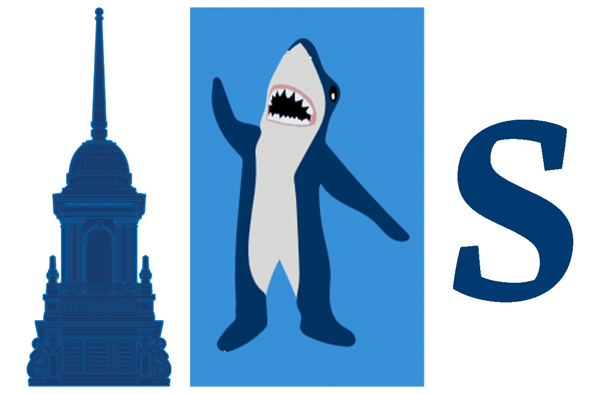
Our primary graphic elements are the cupola and a new “Super S” shape. Graphics involving the Simmons mascot, Stormy the Shark, are used sparingly.

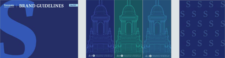
The Simmons Cupola
Historically we’ve used a silhouette of the Simmons cupola to represent the rich history and tradition of the university and its place in the city. That spirit continues in this current rendering, whose more intricate detailing not only reflects the sophistication of Simmons but also, on a practical level, lends itself better to larger-scale renderings. The cupola may stand alone as a graphic rendered in any brand color, or its silhouette may be used as a container for photography or other artwork. It may be filled with solid color for small-scale uses but should be rendered in full detail when used for larger applications.

The Simmons "S"
We’ve long used a standalone “S” for athletics marketing and as a small-scale identity marker in the digital space. Now pulling from our updated wordmark and rendered in our signature Artigo typeface, the Simmons “S” offers a new opportunity to com- bine name recognition and graphic interest. The “S” may be rendered at any scale and in any brand color, cropped or offset from the page grid, or used as a container for photography or other artwork. Please note that it is a graphic and not an official brandmark and therefore may not take the place of an approved brandmark to be the sole identifier of the university in a communication.
Graphic Component Use
The Simmons brand aesthetic prizes a strong interplay of color, type, and graphic elements arranged on a single plane, generally avoiding complicated overlays (with the exception that text and brandmarks may be placed over photography when colored effectively). Text should never be placed over a brandmark. A tone-on-tone approach (a lighter blue over a darker blue, for example) to colorizing graphic elements infuses nostalgic references with a current of intensity, binding the energy of our newest Simmons students and alums to that of our earliest; it also adds visual depth without layering.
Stormy the Shark

Stormy Graphics and Messaging
Any shark graphics or messaging in non-Athletic communications should be limited and used to add a feeling of fun when appropriate and should not replace or overshadow the Simmons University brand.
Shark messaging should not be the primary message of any communication or material. Make sure to prioritize the content the communication needs to convey and the actions you want people to take.
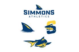
Sharks Athletics
The Athletics suite of shark logos and graphics is not a component of our central brand and should be employed primarily by Simmons University Athletics, a use which also extends to athletics-themed apparel offered in the Simmons University Bookstore.
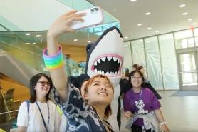
Stormy Mascot Costume
Use of the physical Stormy the Shark mascot costume is not governed by an Athletics-only policy and may be dispatched to a campus event of any kind at the discretion of the event organizer. Photos of Stormy fall under the category of shark graphics and should be used with the same care to not override other crucial messaging.
Please email [email protected] to check availability, reserve, and to arrange to pick up and return Stormy.