Color Palette
Color evokes an emotional response and acts as a unifying visual component for our brand. The official colors of Simmons are dark blue and pure white. These colors play a vital role in establishing a clear and powerful image and in defining the Simmons brand.
Consistent use of the Simmons brand colors helps establish our unique visual identity and increases brand recognition.
Combining our primary colors with careful use of our accent color palette allows us to create content with a range of expressions — from institutional to creative and energetic.
Primary Color Palette
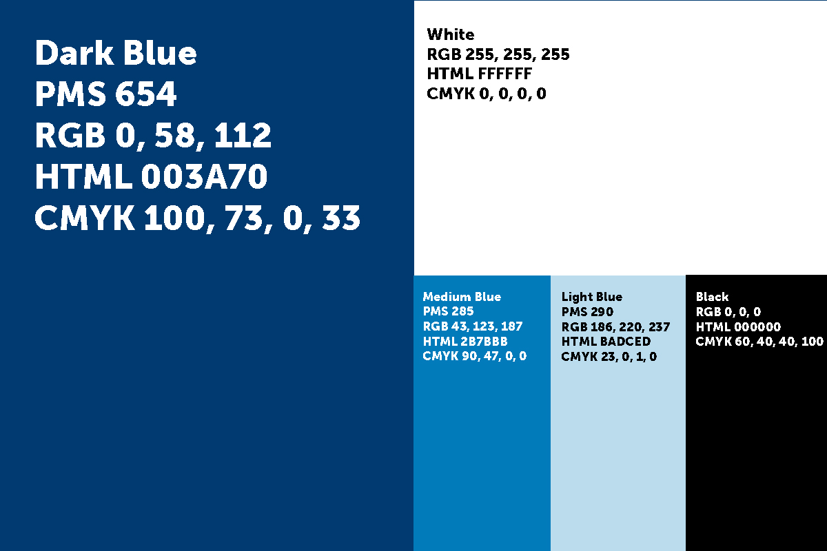
Our chief operating colors are Simmons dark blue and pure white. Because these are the University’s official colors and they carry the strongest brand equity, all of our communications should use these two colors. They are supported most commonly by two additional blues and a rich black, though not necessarily all at once.
Accent Color Palette
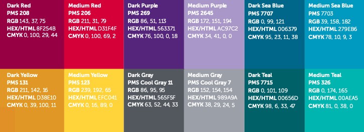
These supporting colors may be used sparingly to add nuance and accents to designs. Do not place any Simmons logos over these colors. These should not be used as a primary color within a piece without the approval and input of University Communications.
Color Codes
Dark Blue
PMS 654
RGB 0, 58, 112
HEX/HTML 003A70
CMYK 100, 73, 0, 33
White
RGB 255, 255, 255
HEX/HTML FFFFFF
CMYK 0, 0, 0, 0
Medium Blue
PMS 285
RGB 43, 123, 187
HEX/HTML 2B7BBB
CMYK 90, 47, 0, 0
Light Blue
PMS 290
RGB 186, 220, 237
HEX/HTML BADCED
CMYK 23, 0, 1, 0
Black
RGB 0, 0, 0
HEX/HTML 000000
CMYK 60, 40, 40, 100
Dark Red
PMS 208
RGB 143, 37, 75
HEX/HTML 8F254B
CMYK 0, 100, 29, 44
Medium Red
PMS 206
RGB 211, 31, 79
HEX/HTML D31F4F
CMYK 0, 100, 69, 2
Dark Purple
PMS 269
RGB 86, 51, 113
HEX/HTML 563371
CMYK 76, 100, 0, 18
Medium Purple
PMS 2645
RGB 172, 151, 194
HEX/HTML AC97C2
CMYK 34, 41, 0, 0
Dark Sea Blue
PMS 7707
RGB 0, 99, 121
HEX/HTML 006379
CMYK 95, 23, 11, 38
Medium Sea Blue
PMS 7703
RGB 39, 158, 182
HEX/HTML 279EB6
CMYK 78, 10, 9, 3
Dark Yellow
PMS 131
RGB 211, 142, 16
HEX/HTML D38E10
CMYK 0, 39, 100, 11
Medium Yellow
PMS 123
RGB 239, 192, 65
HEX/HTML EFC041
CMYK 0, 16, 89, 0
Dark Gray
PMS Cool Gray 11
RGB 86, 95, 95
HEX/HTML 565F5F
CMYK 63, 52, 44, 33
Medium Gray
PMS Cool Gray 7
RGB 152, 154, 154
HEX/HTML 989A9A
CMYK 38, 29, 24, 5
Dark Teal
PMS 7715
RGB 0, 101, 109
HEX/HTML 00656D
CMYK 98, 6, 33, 47
Medium Teal
PMS 326
RGB 0, 174, 165
HEX/HTML 00AEA5
CMYK 81, 0, 38, 0
Color Use
Designs should not use every, or even most, of the colors in the palette. Besides the dark blue and white, which are primary brand colors and should appear in all Simmons collateral, pick 1-2 accent tones. This can be a set of reds and a set of blues, for example, or a teal and yellow, etc.
The Athletics color palette is our Simmons dark blue and medium yellow. This should be applied as a primary color scheme only to Athletics materials and collateral.
Our approach to color is grounded in reverence for Simmons’ history and continued role as a serious trailblazer for social equity. Communication designs should use limited but confident palettes to enhance messages and typography.